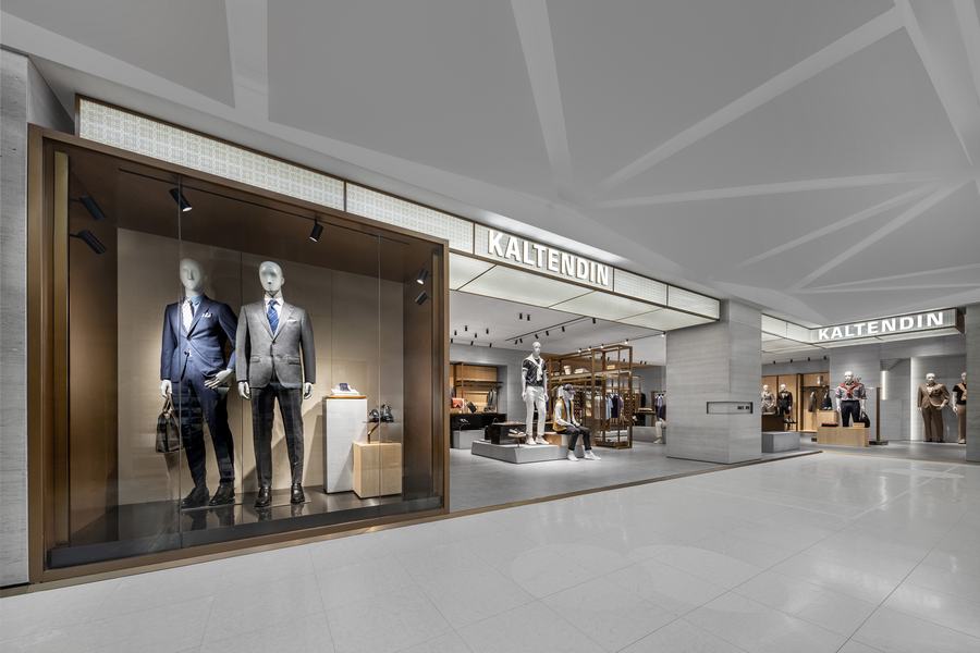
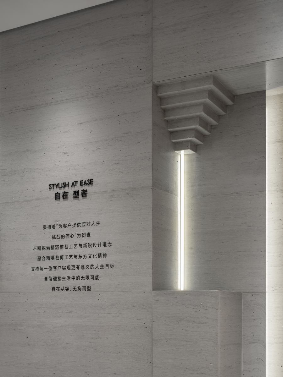
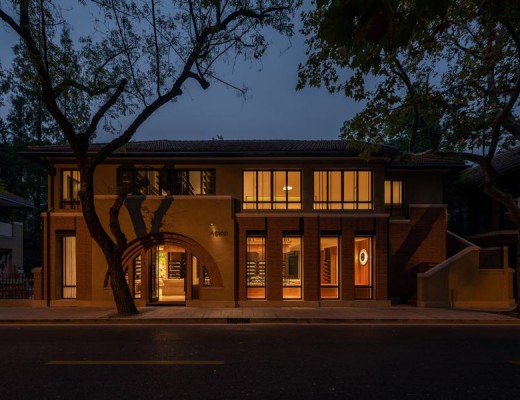
▲主入口,entrance
1993年,彼时正值中国逐步开放的时代语境之中,人们对于服装的需求也从传统的“老三样”(中山装、军便装、人民装,并称为服装“老三样”)转向更与国际融合的西装领域,由此掀起一阵服装变革的浪潮,有学者将这一现象称为“90年代西装狂热(suit fever)”。卡尔丹顿正是成立于这样的时代背景下。
In 1993, amid the gradual opening-up of China, a shift in the socio-economic context, people’s clothing preferences transitioned from the traditional “Three Olds” (Zhongshan suit, military uniform, and people’s suit, collectively known as the “Three Olds” in clothing) towards the internationally integrated domain of suits. This sparked a wave of clothing revolution, coined by some scholars as the “Suit Fever of the 90s.” It was against this backdrop that KALTENDIN was founded.
▲图源:X博士(ID:doctorx666)《西装崇拜与八九十年代》

随着时代的发展,品牌也见证并参与着城市与生活的变革——以经典隽永的服装风格为基础,不断打磨适合东方人身型的版型剪裁。在品牌三十周年之际,作为其形象升级的重要一环,卡尔丹顿邀请MOC打造全新的形象标准。
With the development of the times, the brand has witnessed and actively participated in the transformation of urban life—building upon a foundation of timeless and classic clothing styles, continually refining tailored cuts to suit the body shapes of individuals in the East. On the occasion of its 30th anniversary, as a crucial component of its image upgrade, KALTENDIN has invited MOC to create an entirely new standard for its store identity.
卡尔丹顿是现代典雅与精致东方融合的缩影。MOC希望在空间中将融合东西方智慧的品牌坚持表达出来。
KALTENDIN epitomizes the fusion of modern elegance and exquisite Oriental essence. MOC aims to express the brand’s commitment to integrating Eastern and Western wisdom in the spatial design.

设计师将东方气质蕴含于现代的基调之中,东西文化的融合造就了一种属于品牌的美学语言。
The designer infuses Eastern qualities into the contemporary tone, resulting in the creation of a brand-specific aesthetic language through the fusion of Eastern and Western cultures.
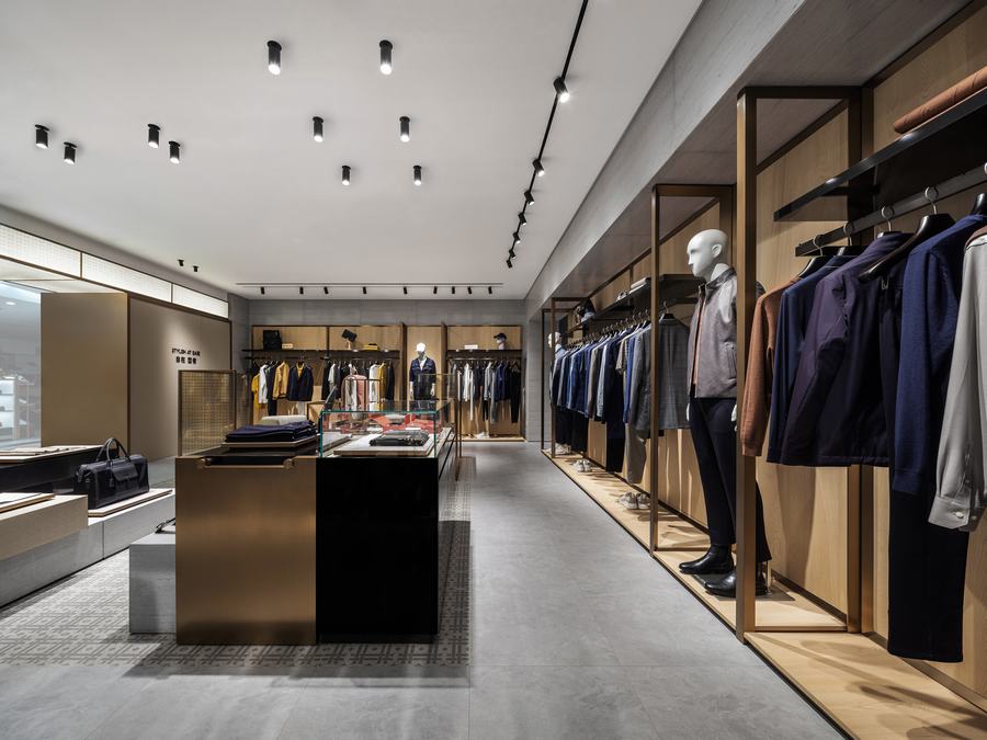
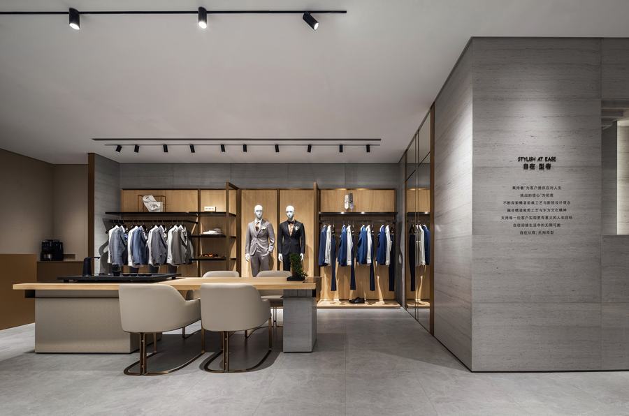
在典雅的基调下,设计师以传统文化场景中典雅韵致的“屏风”为灵感,奠定了产品展示的形式框架。精致比例分割与完美的细节形成了一种深思熟虑、严谨的设计风格。
Under the backdrop of elegance, the designer draws inspiration from the refined charm of traditional cultural scenes, using the “screen” as a framework for product displays. The meticulous proportion divisions and perfect details contribute to a thoughtful and rigorous design style.
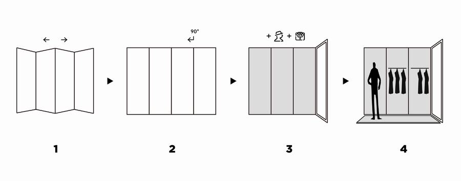
屏风围合出的休息区也暗含东方美学趣味。在项目实践中,“屏风”被视为一种文化的象征,是“凡事有度”的东方智慧的体现。
The enclosed resting area formed by the screens also subtly incorporates Eastern aesthetic nuances. In the practical implementation of the project, the “screen” is regarded as a symbol of culture, reflecting the wisdom of Eastern philosophy that emphasizes moderation in all things.
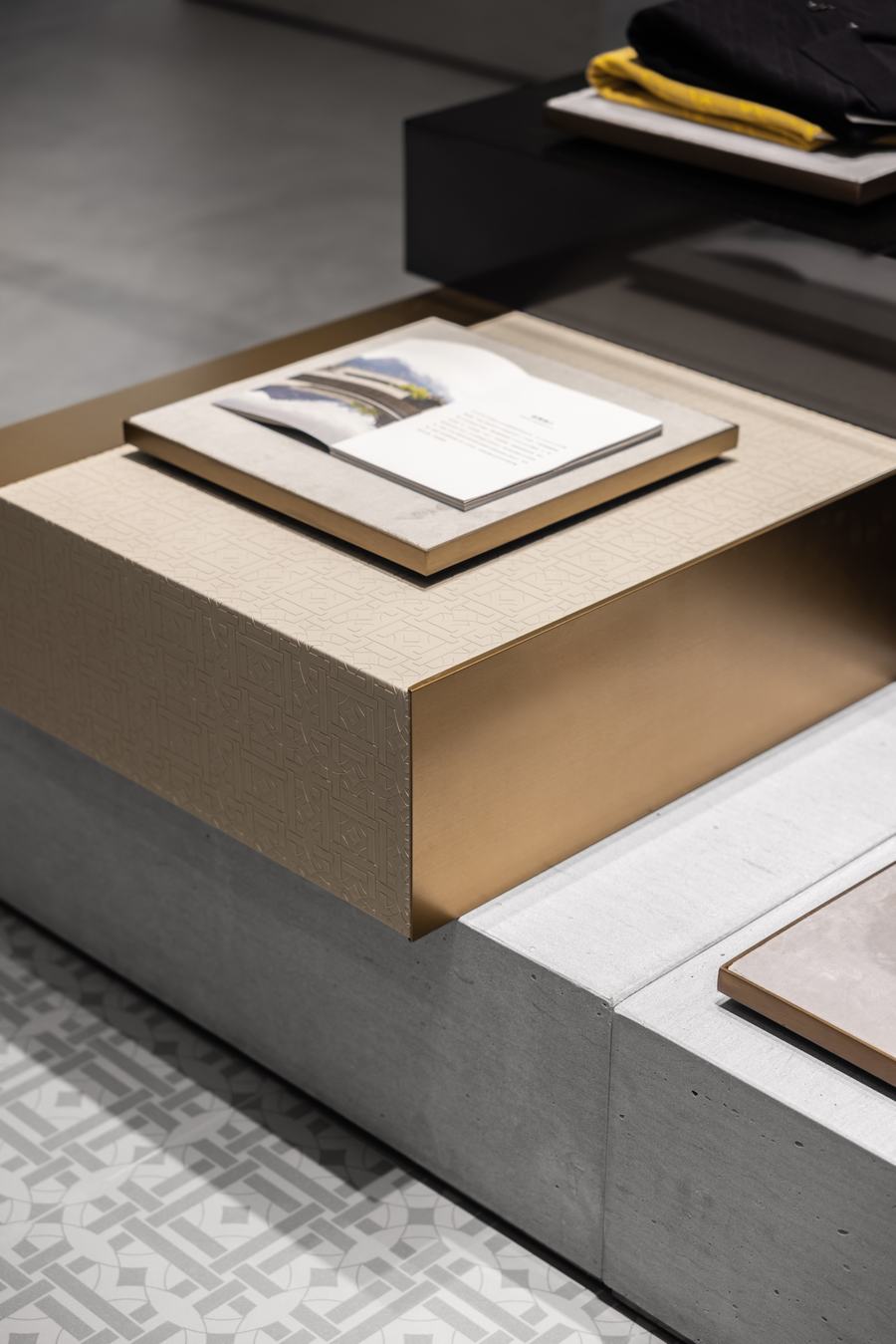
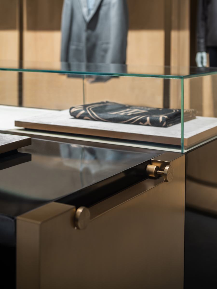
展台设计细节
Design details of the exhibition booth
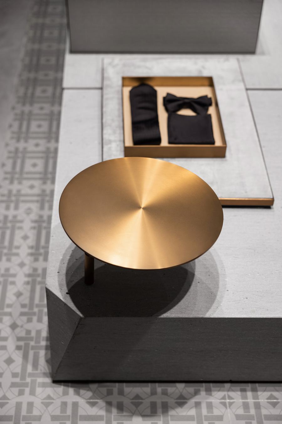
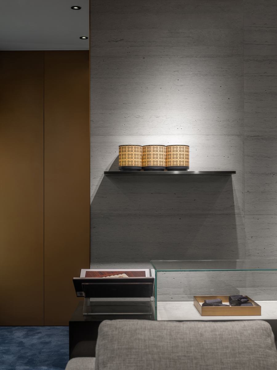
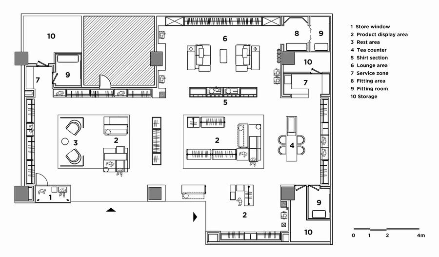
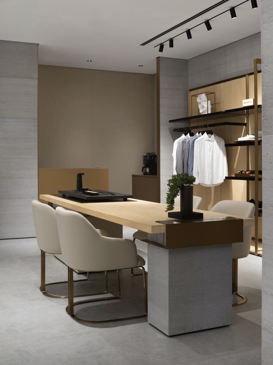
茶台设置于空间的一侧,融合西式中岛台的设计元素,原本沉稳厚重的中式茶台变得更为现代,又不失东方禅意。
A tea counter is set on one side of the space, integrating design elements from Western-style islands. The traditionally steady and robust Chinese tea counter takes on a more contemporary look, while retaining an Eastern Zen ambiance.
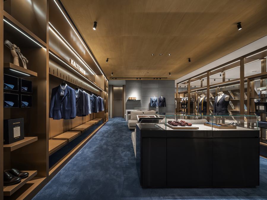
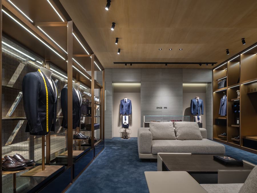
高定区通过深蓝色的地毯沉淀出沉稳的调性,经典的家具与木质的天花共同构建出高雅的氛围。
The high couture area establishes a poised ambiance with a deep blue carpet, while classic furniture and wooden ceilings collaboratively create an elegant atmosphere.
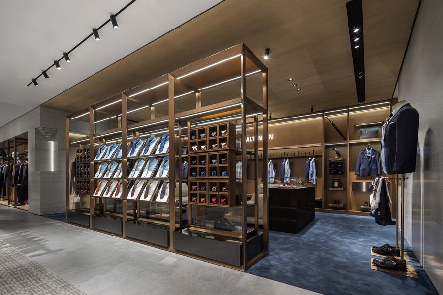
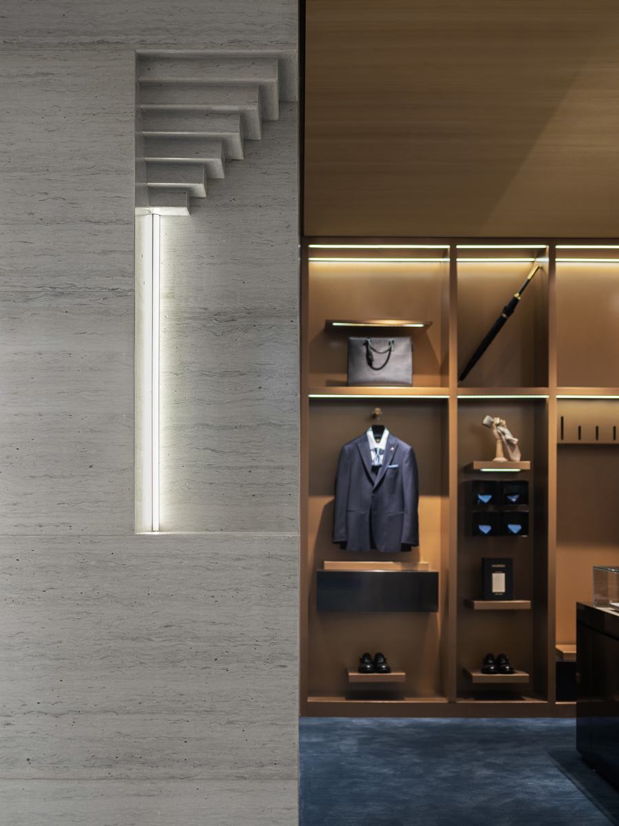
▲定制区内,设计师搭配了经典的现代家具,呈现隽永典雅的精英气质。
In the high couture area, designers have combined classic modern furniture to showcase a timeless, elegant elite ambiance.
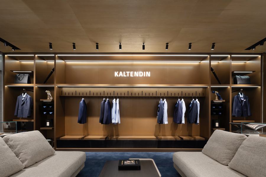
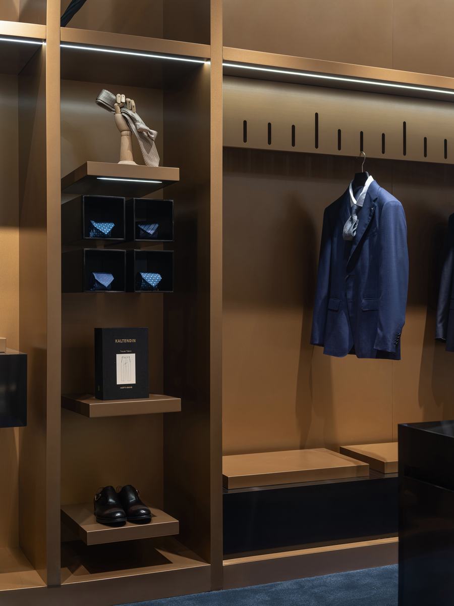
这个区域内,设计师追溯定制的概念,以皮尺的刻度为元素打造精品定制墙,呈现精致严谨的精英气质。
Within this area, the designer revisits the concept of customization, using the scale of a ruler as an element to craft a bespoke wall. This presentation showcases a meticulous and sophisticated elite quality.
设计单位: MOC DESIGN OFFICE (www.moc-office.com )
主持设计:梁宁森,杨振钰
设计管理:吴岫微
设计团队:MOC设计团队
设计周期:2023.4-2023.6
竣工:2023.9
项目地址:海南省海口市望海国际广场4F
面积:268㎡
主材:灰洞石,木饰面板,铜色喷砂不锈钢,黑色不锈钢,定制皮革硬包,地砖,地毯
业主:卡尔丹顿
摄影:聂晓聪


